THAI KANOM
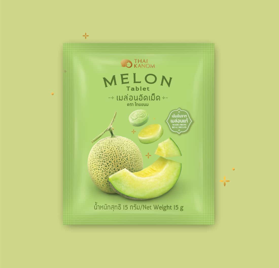
Thai Kanom’s new products were challenging. They look just like milk tablets but actually are concentrated fruit tablets. We used a fruit morphing into a tablet as the key visual for each flavour. The used typeface has Thai style and the backgrounds are covered in Thaitone™ colours emphasising this modern Thai snack brand.


